
Responsive web design
for the bank's Sign-up process
MY ROLE
Solo designer—discovery, user research, design, wireframing, prototyping and testing

Topics
-
Overview
-
Understanding users
-
Define problem
-
Generate ideas
-
Wireframe & Lo-fi prototype
6. Test & iterate
7. Mockup & Hi-fi prototype
8. Summary and Learning
Overview
Bangkok Master Bank is my project to design a responsive web sign-up process for a banking website. The goal is to create an accessible and user-friendly investment website for all generations. Following the UXUI process to ensure that the website meets the needs of users. The process includes user research, wireframing, mockups, and development.

Overview desktop hi-fi prototype
Understanding users
Goals and pains from the in-depth interview with 5 participants summarized as
a result of user stores
Goals:
-
To make a mobile cash withdrawal
-
To avoid yearly fees for ATM cards
-
To obtain high interest rates while reducing risk
-
To use cardless for a variety of transactions
-
To use financial applications while utilizing the welfare state
Pains:
-
Uncomfortable branch authentication
-
Lack of knowledge about useful financial products
-
Face recognition makes them frustrated

We interviewed five participants who always use banking apps every day to understand their goals, pains, experiences with the sign-up process, and other features. The user stories in this case provide valuable insights into the target audience's goals and pain points. The users want to be able to make mobile cash withdrawals, avoid yearly ATM fees, and use financial applications while utilizing the welfare state. They also find branch authentication uncomfortable and face recognition frustrating.
PROJECT OBJECTIVES
🔨 Build: The future banking app that has all-in-one features, whether for daily transactions or investing in global stocks, bonds, and mutual funds.
🔍Understand: deep understanding of the kinds of products' users and the business model.
🎨Design: modern, professional, and fun interface of a banking app for all generations of users to have fun in their financial lives.
📱Responsiveness: responsive design between a desktop website and smartphone application will flow seamlessly.
DEFINE PROBLEM
User personas


.png)
Two user participants from the group of five represent two different types of professionals: the first is a government official with an economical lifestyle who wants to cut down on transaction fees, and the second is a private official who wants to enjoy using various investment products.
Their journey

Users are a little eager to sign up and register an account after downloading and installing the banking application. When entering personal information, they want to have trust that the user interface is secure. However, they think it tedious to read and confirm the PDPA consent and agreement conditions, and the majority of them prefer to skip. Additionally, they experience frustration during authentication and facial verification. They feel good when the signing up process is complete and they can begin performing transactions, making deposits, or withdrawing money.
Generate idea
Ideas were first developed using a variety of techniques, including competitive analysis, crazy8, card sorting and information architecture.

Competitors analysis

Result of the open card sorting

Information architecture
Idea summary
In addition to having trustworthy reputations and professional user interfaces, our direct and indirect competitors also excel in these areas. We want to create a similar experience for our users while also humanizing the content and providing shortcuts for features that are relevant to their everyday lives. The findings of card sorting and information architecture indicate that we should divide the material into three primary categories: "Manage," "Benefits," and "Contact." We will also incorporate money management feature.

A Crazy 8 tool to sketch many drafts of the interface of a responsive website
Wireframe
& Lo-fi prototype
In the ideation process, we generate the sketches from Crazy 8 into wireframes and make page interactions into prototypes for desktop and mobile.

Medium desktop prototype

Medium mobile prototype
Usability test
Usability test from 5 participants with 20 minutes for each round to validate the prototype and identify issues, bottlenecks, and complexity of flows from users experiences.

Affinity diagram
Accumulating plenty of information and ideas from the usability test. Then organize the data into 7-8 meaningful themes, including home and overall page flow, confusing pages, scrolling to unlock terms, details of identity cards, face verification, etc.

Organize users' themes to find insight.
Prioritize the insights
🔴 P0
-
After inputting, password fields need to be covered, and there are rules for secure passwords.
-
Importantly, the page should scroll such that the accept button can be enabled
-
The choice button with the positive flow should be more noticeable than the reject button when denying consent or terms.
-
The snap button and face scanning were unclear
-
A camera mask guideline for face scanning.
-
When users bring their face close to the appropriate mask, the scan or snap button should automatically activate and snap.
-
-
NDID guide and maybe checking the password again is not necessary.
-
OTP and email verification pages are absent
🟡P1
-
The product page wasn't sure which option to choose for signing up
-
Make the product card intuitively understandable with the title.
-
-
More identity card details are required for registration.
-
The homepage should prioritize each menu, and many people prefer vertical flow to horizon.
Summary
Based on findings from a usability test and affinity diagram involving five participants, key recommendations for UX/UI design improvements include clear password setup instructions and concealed fields for enhanced security. Simplifying the terms acceptance process by enabling users to scroll for the accept button and adding buttons to the decline dialog will reduce friction. Improving the visibility and functionality of the snap button for face scanning, along with automatic triggering when the user's face is correctly positioned, should enhance efficiency. Implementing a camera mask guideline for face scanning is advised. Eliminating the need to reconfirm passwords on the NDID page and addressing the absence of OTP and email verification pages are also crucial steps to streamline and secure the user journey.
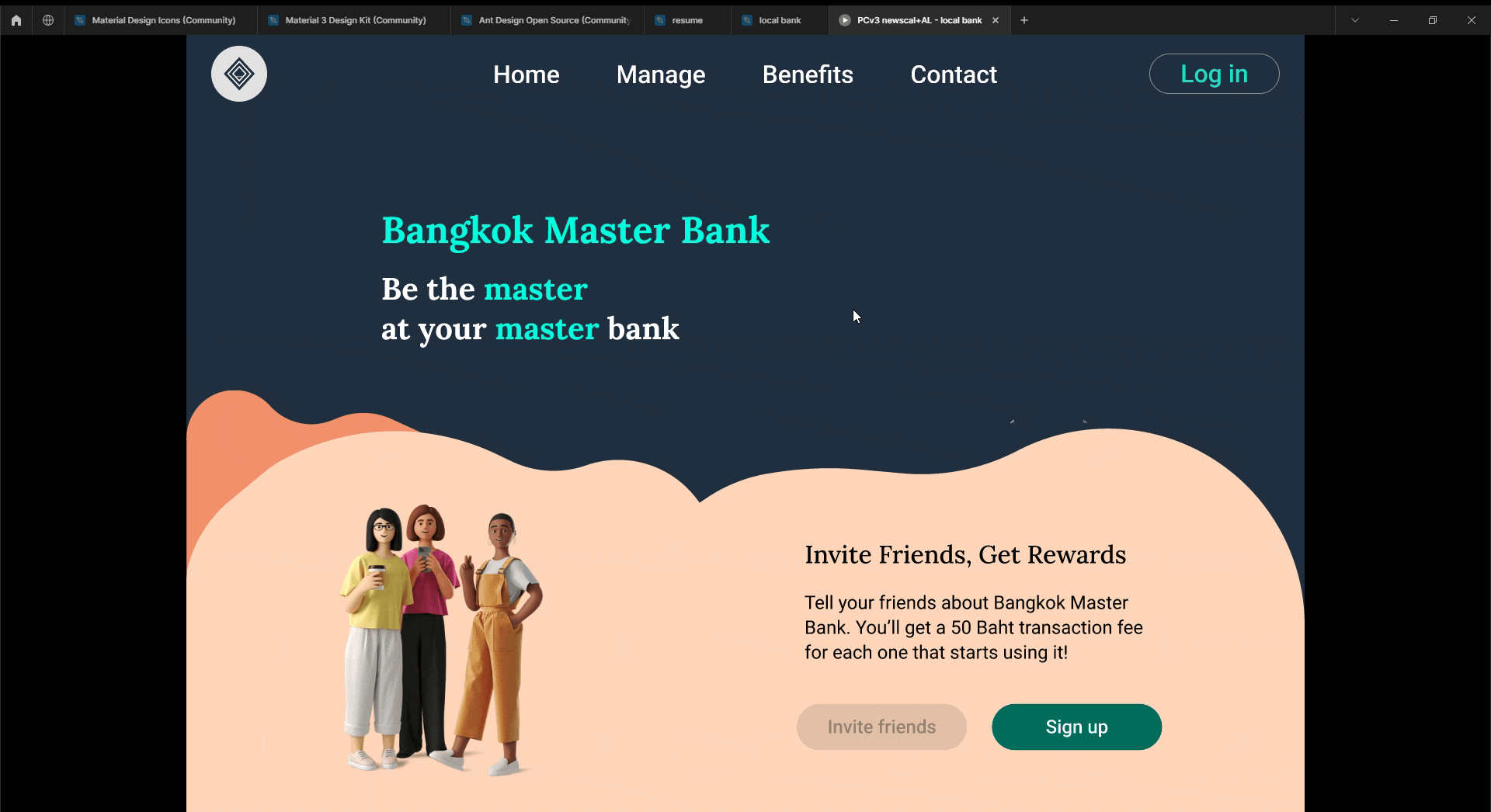
Home page
& Product introduction


Mockup example
Hi-fi prototype


What I have learned and next
-
Conduct a further one or two usability tests to evaluate the design and flow of users' experiences.
-
It is necessary to compare the KPIs for user experience (time on task, success rate, error rate, drop-off rate)
-
Within the subject (between the low-fidelity prototype and the high-fidelity prototype),
-
Between-subjects (between the BMB website/app and other banking/investment apps)
-
-
Develop other features, i.e., investment options, investment tools, global stocks, and other financial products.
-
Adjustable view for more personalization.
-
Dark Mode


